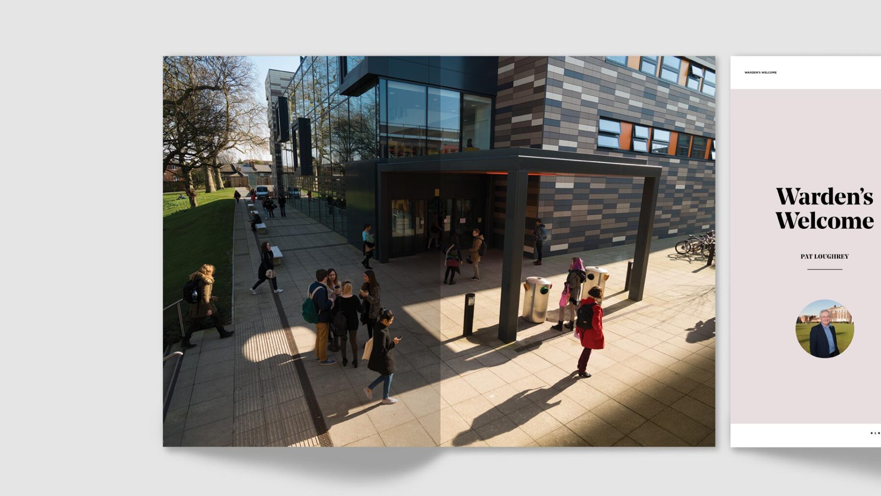
Goldsmiths University of London
Making a difference
Art direction / Design
—
Editorial design
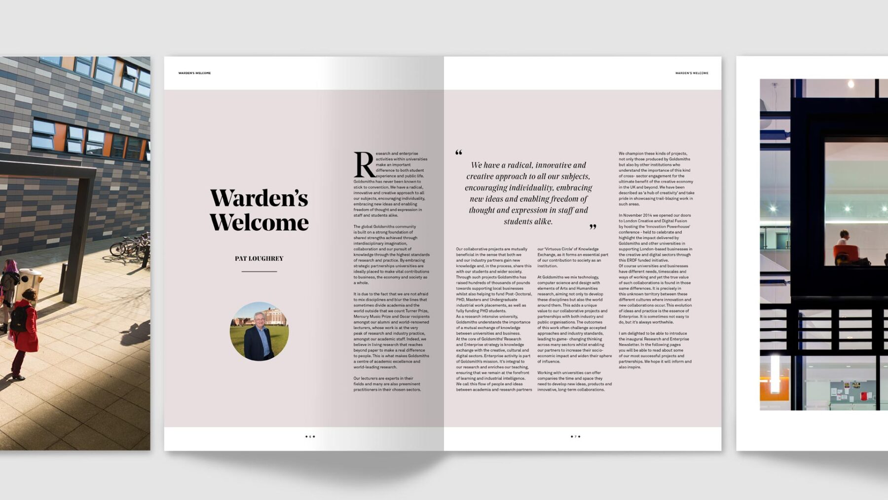
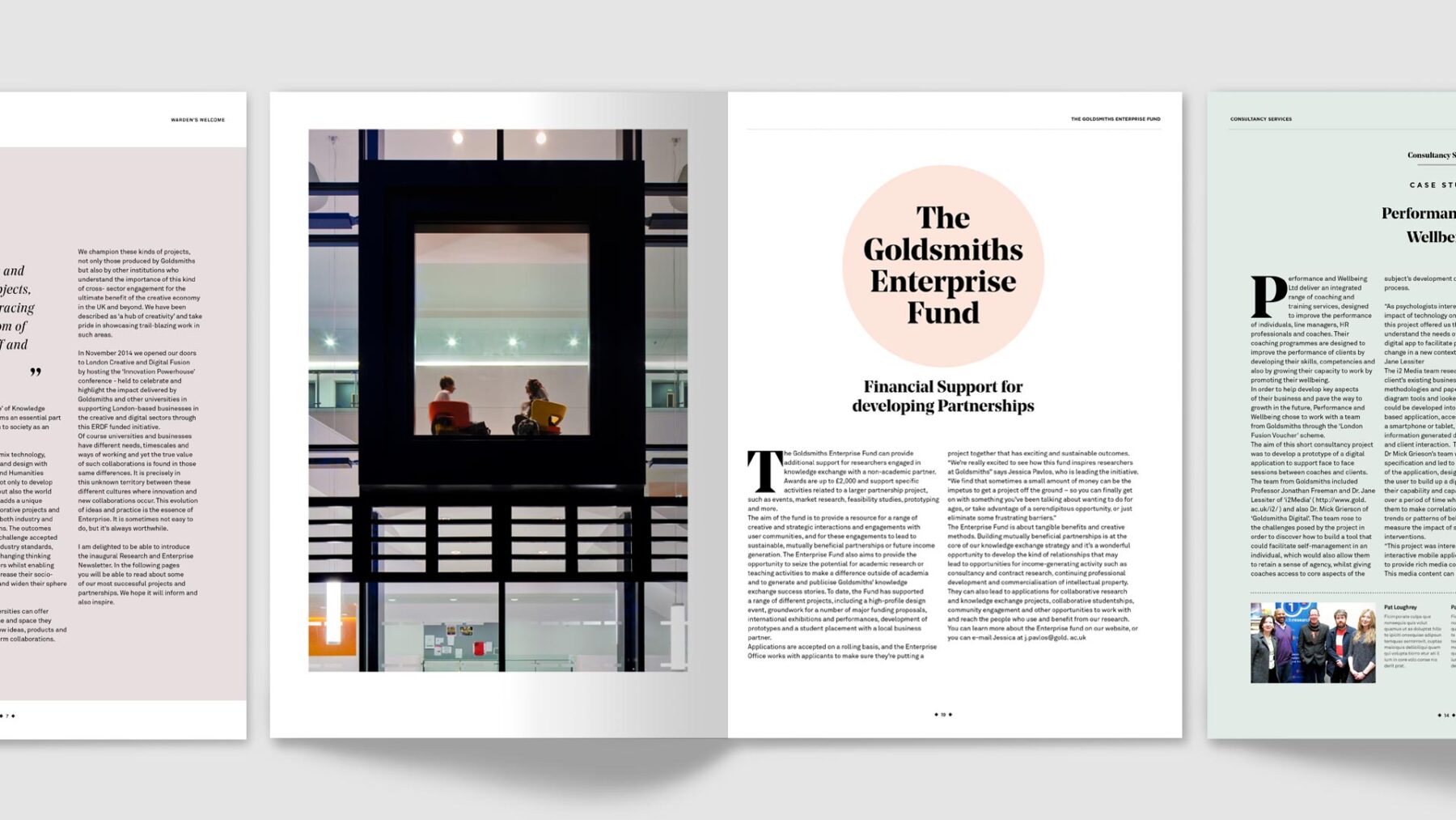
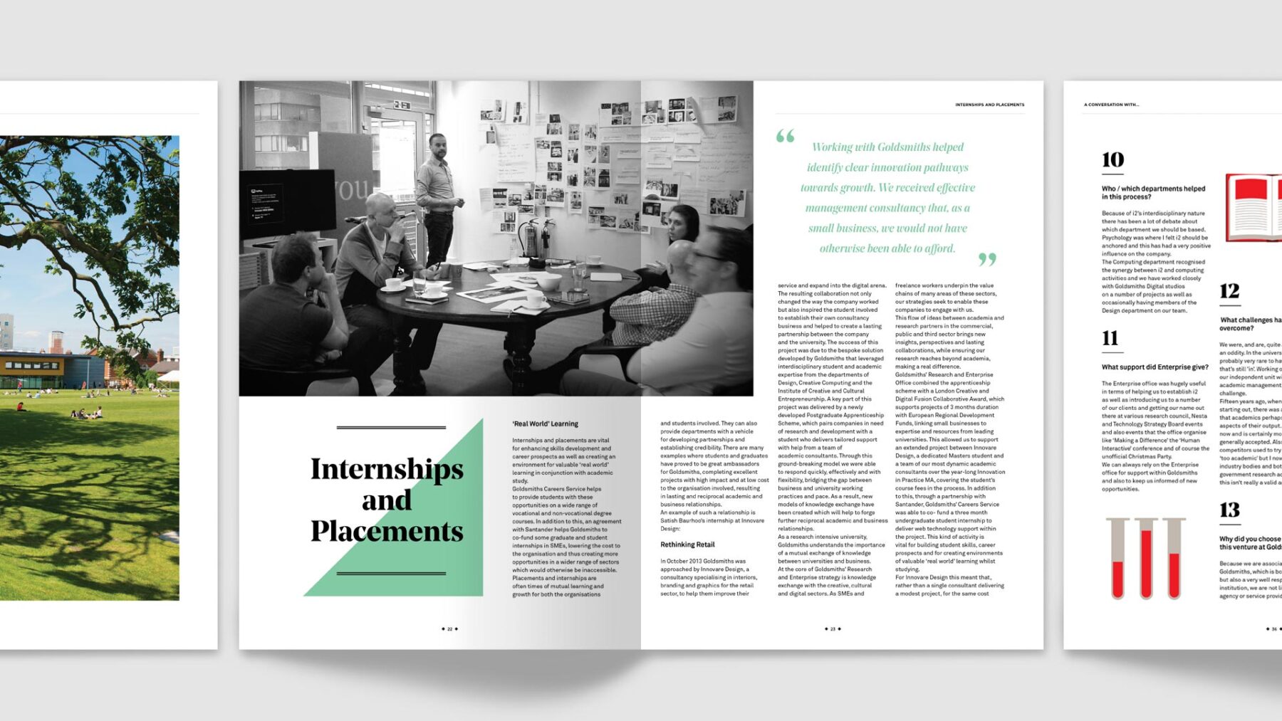
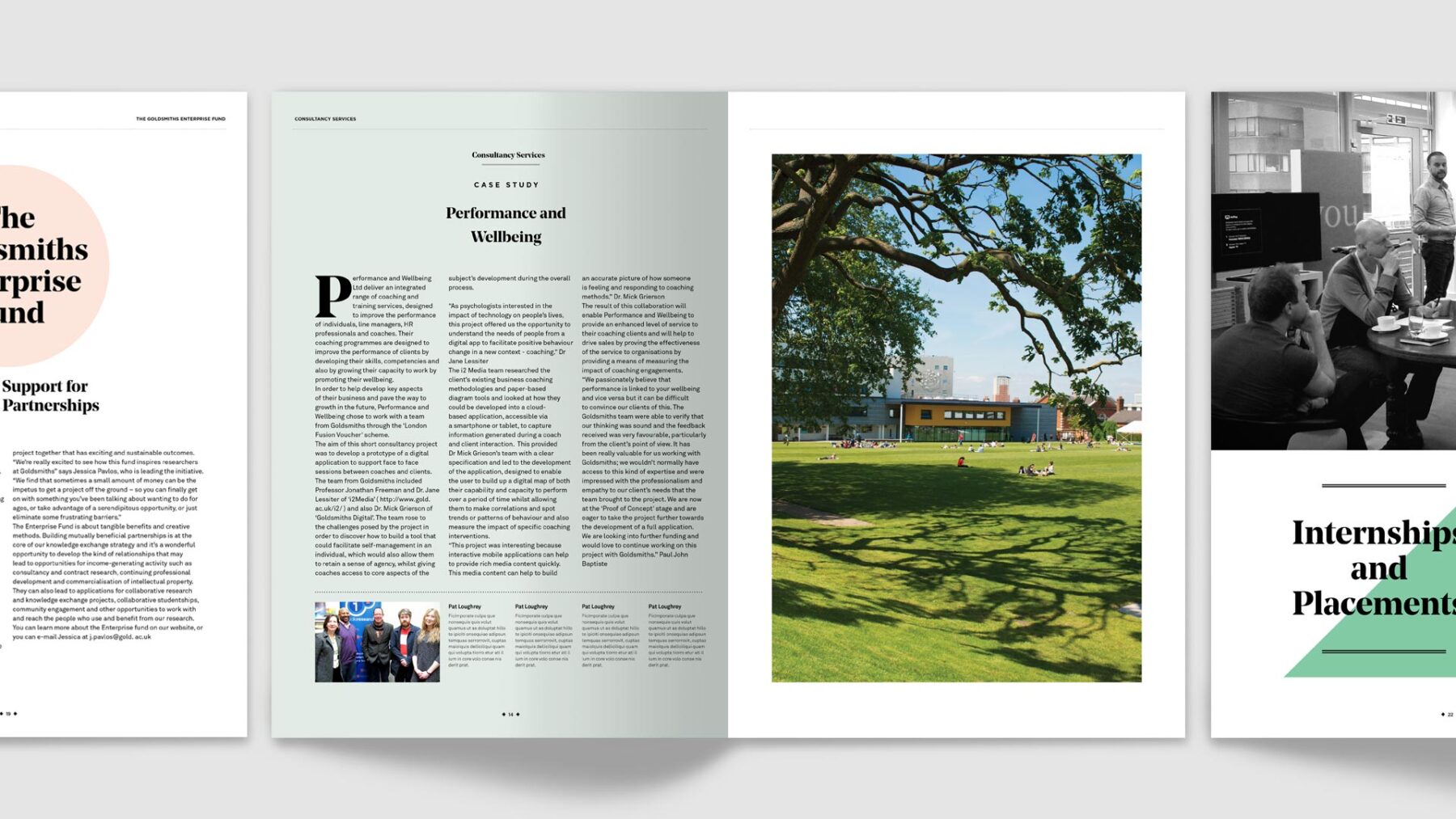
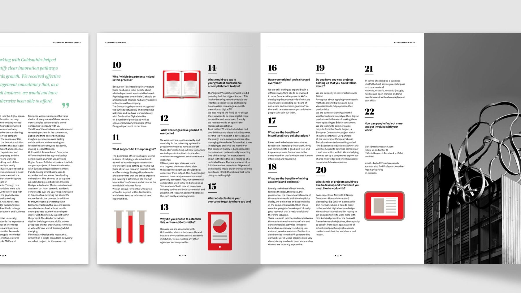
Goldsmiths, University of London, is a public university specializing in the arts, design, humanities, and social sciences. At the request of the university's Research & Enterprise division, We were responsible for designing the new magazine "Making a Difference." The aim was to connect the university with businesses through this corporate-oriented university brochure. By using Goldsmiths' typeface "Gotham," we created a design that emphasizes the connection between the magazine and the university brand.
Goldsmiths University of Londonは、芸術、デザイン、人文科学、社会科学を専門とする公立大学です。大学の研究・企業部門からの依頼で、新しい雑誌「Making a Difference」のデザインを担当しました。その目的は、企業向けの学校案内誌を通じて大学と企業をつなぐことでした。ゴールドスミスの書体 "Gotham"をタイトルに使用し、雑誌と大学ブランドとのつながりを演出しています。
Credits
Art direction / Design: Ryuhei Nakadai (River)